How Crown Social Agency clarified perfcycle.ai’s brand and website
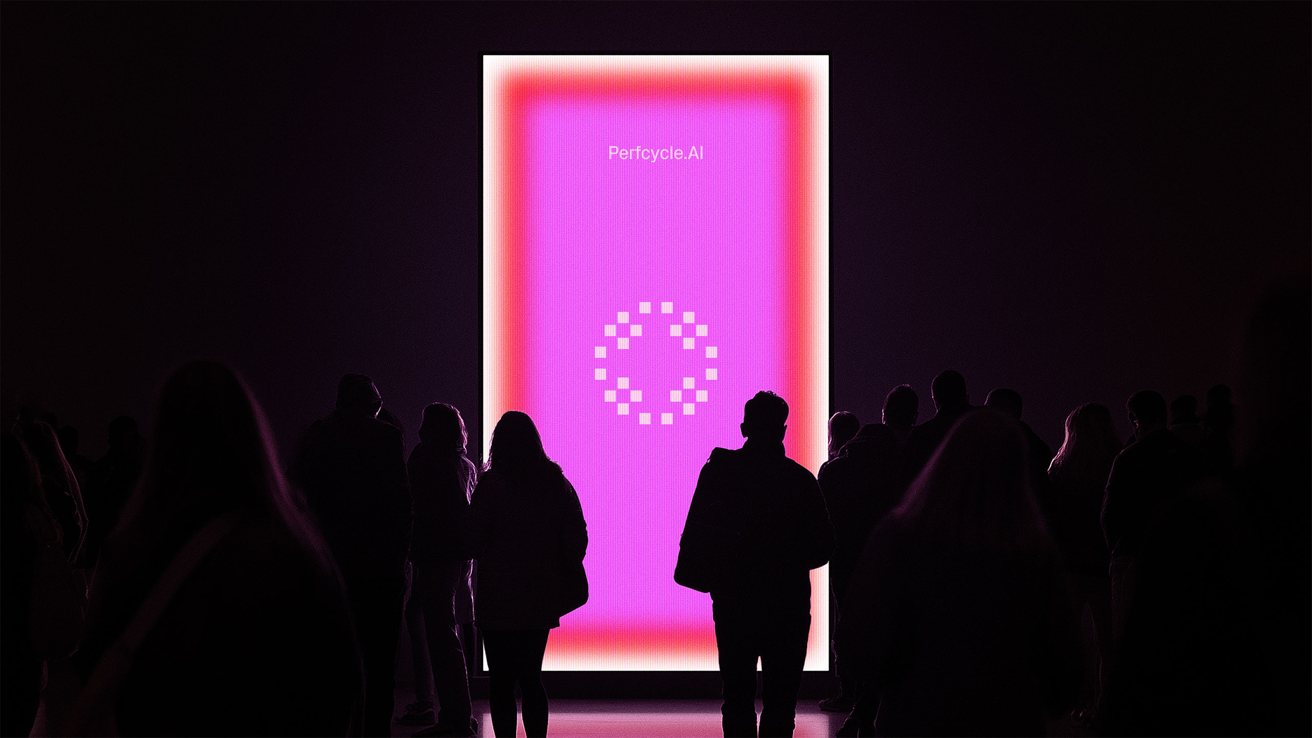


perfcycle.ai turns work notes into performance documentation. Crown Social Agency developed its brand story, identity, website, motion, and video around visible product demonstrations and concise explanations.




The challenge
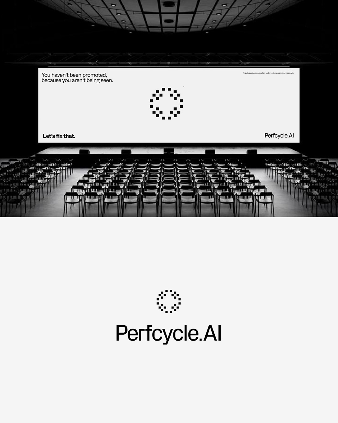
perfcycle.ai helps employees turn everyday notes into records they can use in performance conversations. The site needed to explain that value to individual users and B2B buyers quickly. Instead, dense paragraphs, stacked sections, and familiar startup language delayed the first useful view of the product. The assignment was to make the explanation as efficient as the tool's promise while giving visitors enough clarity to consider an AI-assisted workflow.
The approach
The goal was to move people from promise to proof to action, letting employees and managers grasp the use case in seconds.
Crown set five rules: use verb-first human copy, show the product instead of selling around it, keep fewer and stronger sections, make content glanceable, and offer soft commitments before signup. Live product loops and sample-note demonstrations replaced long descriptions. The voice stayed clear, confident, warm, precise, and human.
The site also had to explain AI-driven value without treating privacy as a footnote, so we featured plain-language assurances that files are private by design and deleted after processing, front-and-center, to assuage an important concern.
The work
CROWN's scope included brand strategy and identity, website design, creative direction, motion, video, and campaign concepts. The identity balanced precision and gravitas with approachability, wonder, and momentum. A mostly monochrome system used controlled accent color and motion to focus attention. The website and app presentations paired concise statements with interface loops and sample-note demonstrations, showing how raw notes become performance documentation. The same verbal rules carried across brand and product surfaces: clear language, a visible workflow, and an invitation to explore without an immediate signup.
The evidence
The product worked: more than eight hours saved per employee per month, a 78% improvement in documentation quality, and a 90% increase in visibility into team performance. And the new experience replaced persuasion with evidence: people could see a workflow, try sample notes, and understand how daily work becomes visible impact.
What we learned
The strongest expression of a time-saving product is a time-saving explanation. Product demonstrations, explicit privacy language, and low-friction trials can carry more credibility than another layer of claims. A consistent verbal and visual system also makes the brand feel like the product, not a campaign wrapped around it.
Captions
An AI product with a time-saving
promise needed a faster explanation.
Dense paragraphs and stacked sections
made the product slow to understand.
The assignment was to make the explanation
as efficient as the tool's promise while giving visitors
enough clarity to consider an AI-assisted workflow.
CROWN needed to move people from promise to proof to action,
letting employees and managers grasp the use case in seconds.
We set five rules:
use verb-first human copy,
show the product instead of selling around it,
keep fewer and stronger sections,
make content glanceable,
and offer soft commitments before signup.
The voice stayed clear, confident, warm, precise, and human.
A mostly monochrome system
used controlled accent color
and motion to direct attention to the product.
Website and app presentations paired concise
statements with interface loops
and sample-note demonstrations,
showing how raw notes and artifacts become
performance documentation.
The same verbal rules carried across brand and product:
clear language,
a visible workflow,
and an invitation to explore without an immediate signup.
The app saved employees more than
8 hours per month,
facilitated a 78% improvement in documentation
quality, and a 90% increase in visibility into team performance.