Naming and Branding a Cloud-Native Enterprise Infrastructure Platform


Before it was Neutrino, EMC's new private-cloud platform was known internally as Project Caspian. The technology promised to make deploying and managing cloud-native infrastructure considerably easier. It needed a market-facing identity to match that ambition.
Working alongside EMC's product team, Crown Social Agency helped develop the Neutrino name and explored three distinct creative directions: one inspired by astrophysics, another by minimalist design, and a third by the emerging cultural fascination with artificial intelligence. Under the guiding proposition *Uncloud the Cloud*, we developed identity concepts, visual languages, launch creative, motion treatments, and branded applications.
The Neutrino name went on to become part of EMC's commercial VxRack product family.
From Project Caspian to Neutrino
Somewhere inside EMC in 2015, a new cloud infrastructure platform was taking shape under the working name Project Caspian.
It was an ambitious piece of engineering. Building a private cloud traditionally meant bringing together hardware, storage, networking, software, and specialists who knew how to make everything cooperate. Caspian was designed to package much of that complexity into a preconfigured, enterprise-grade platform.
Its internal positioning document described the idea as a turnkey private cloud in a box, with OpenStack, automated provisioning, and the flexibility to support different applications and services on shared infrastructure.
For the people building it, the proposition was clear. For everyone else, there was a great deal to explain.
Crown Social Agency worked alongside EMC's team on the naming and brand development. The process eventually produced Neutrino, a name borrowed from particle physics.
Uncloud the Cloud
The private-cloud category had no shortage of complicated language.
Infrastructure-as-a-service. Hyperconvergence. OpenStack. Software-defined architecture. Container-based provisioning.
Every term meant something specific, but together they made a product designed to simplify technology sound rather complicated.
We organized the branding exploration around a proposition that acknowledged the problem directly: *Uncloud the Cloud*.
The work began with three creative territories, each approaching Neutrino from a different angle. We developed identity marks, graphic languages, messaging, social campaign concepts, motion treatments, and physical brand applications to demonstrate how each direction could work beyond a logo.
Cosmic Boom: Into the unknown
The first direction took the Neutrino name almost literally.
Space was having a cultural moment. *Interstellar* and *The Martian* had brought the scale and strangeness of space exploration into mainstream entertainment. We borrowed some of that curiosity and applied it to a product that ordinarily might have been advertised with a photograph of a server rack.
We called the concept *Cosmic Boom*.
The visual language combined vivid blue and violet clouds, cosmic imagery, and abstract forms with a geometric N symbol. Typography and illustration gave the system a scientific character without borrowing the visual conventions of traditional enterprise IT.
The creative explored themes of discovery and the possibilities beyond familiar technology.
We developed logo treatments, teaser and launch graphics, a proposed Twitter identity, printed materials, and merchandise. The identity was designed to accommodate both dramatic imagery and quieter applications.
There was an appealing contradiction in it. Neutrino was intended to take the mystery out of private-cloud infrastructure. We were using some of the universe's greatest mysteries to introduce it.
Confidently Simple: Private cloud in a box
Our second direction approached the problem from the opposite side.
Neutrino promised to reduce the work involved in deploying and managing private-cloud infrastructure. If that was the product's central advantage, perhaps the brand ought to demonstrate the same kind of simplicity.
We called this territory *Confidently Simple*.
The design traded cosmic spectacle for white space, subtle geometry, restrained typography, and a minimal dimensional symbol. Its primary mark resembled an open cube, an abstract representation of a physical system made accessible.
The Sentient Cloud: What if your cloud could think?
The third concept was the most mischievous.
Around the same time, films such as *Her* and *Ex Machina* were bringing artificial intelligence and machine consciousness into popular conversation. Intelligent machines were becoming a familiar idea outside research laboratories.
We wondered what an enterprise-cloud product might look like if it had something approaching a personality.
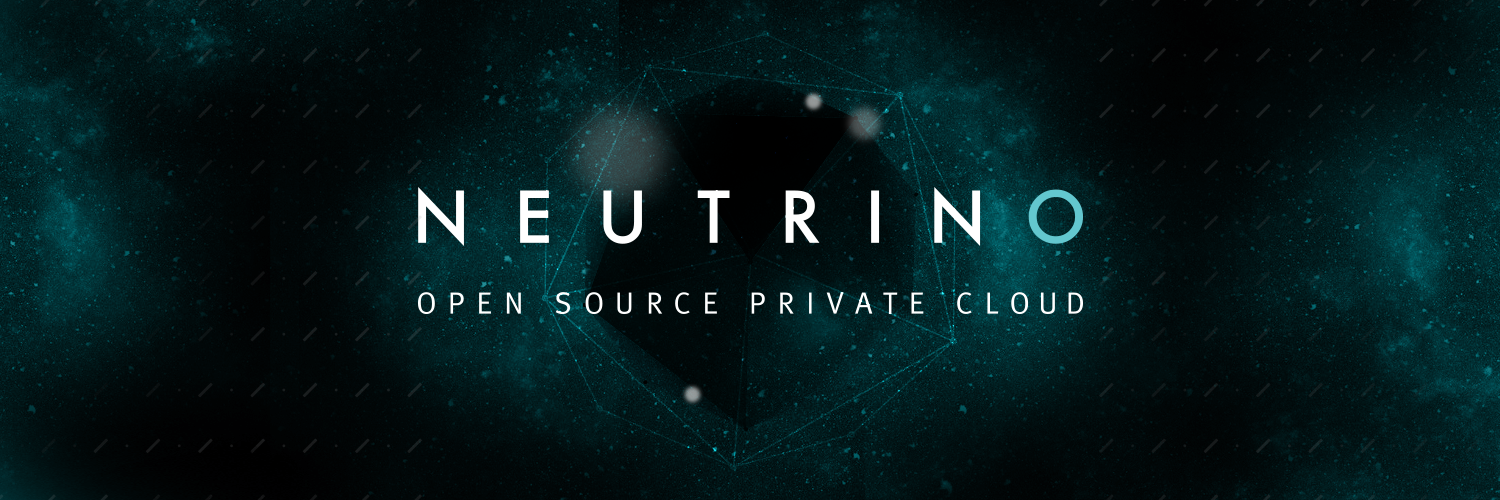
*The Sentient Cloud* gave Neutrino a science-fiction identity, drawing on dark environments, polygonal structures, luminous networks, and imagery suggestive of neural systems.
The proposed language was occasionally rather cheeky.
"You know what you want from your cloud. But does your cloud?"
Another launch concept introduced the product as though it were a new acquaintance:
"Hello, my name is #Neutrino. Pleased to meet you."
Building the identity beyond the logo
The three directions were deliberately different, but we developed each as something that could support a real product launch.
That meant thinking through how a symbol would behave in motion, how typography would work in a social post, how the colors would translate into printed material, and whether the identity could still be recognized when reduced to a small profile image.
Each concept was presented through tangible applications rather than an isolated logo.
Captions
InEMC was building a new private-cloud platform.
Inside the company, it was known as Project Caspian.
It promised to make deploying and managing enterprise cloud infrastructure considerably easier.
OpenStack. Automated provisioning. Shared infrastructure. One system to manage it all.
The engineering was complicated.
The idea was to make using it less so.
Crown Social Agency was brought in to help give the product a brand.
Working alongside EMC's team, we helped develop a new name.
Neutrino.
Borrowed from particle physics.
A tiny, elusive particle that passes through ordinary matter almost unnoticed.
Which gave us a rather interesting place to begin.
Our guiding proposition was *Uncloud the Cloud*.
And we developed three very different creative directions around it.
The first was called *Cosmic Boom*.
Inspired by astrophysics, space exploration, and the extraordinary colors of distant galaxies.
We developed an identity filled with blue and violet clouds, geometric forms, and a sense of scientific discovery.
The second direction went almost completely the other way.
We called it *Confidently Simple*.
White space. Restrained typography. Folded surfaces.
An open cube became the central symbol.
A simple physical form for an otherwise invisible technology.
And then there was *The Sentient Cloud*.
Science fiction had become particularly interested in intelligent machines.
We thought Neutrino might enjoy having a personality of its own.
Dark environments, angular forms, and luminous networks gave it a distinctly different character.
The messaging was rather playful, too.
"You know what you want from your cloud. But does your cloud?"
Each concept extended beyond a logo.
We developed visual systems, launch messaging, social creative, motion treatments, and branded merchandise.
Three different ways to introduce the same technology.
One looked to the universe.
Another reduced complexity to a simple form.
And the third wondered what would happen if the cloud started talking back.