How Crown Social Agency built Keepers’ identity and packaging
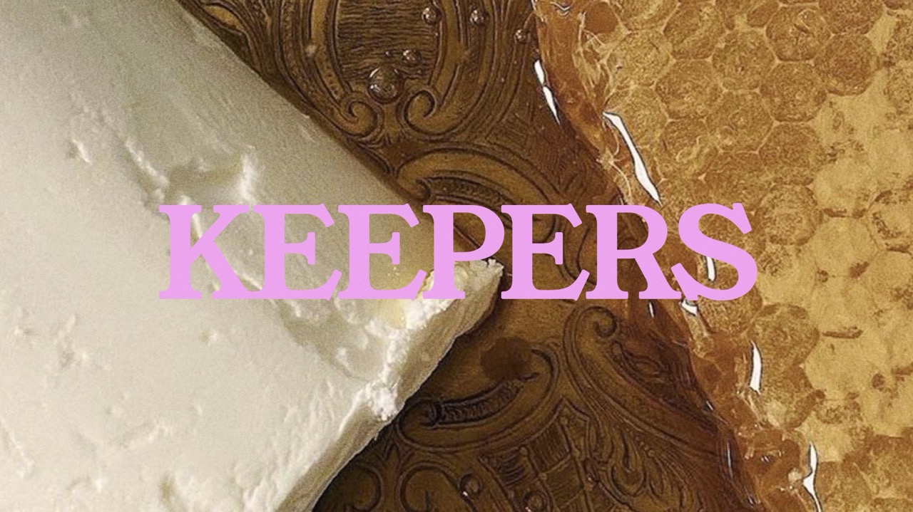
In a low-awareness category where trust precedes trial, we built a distinctive packaging system designed to make every new product increase recognition of the whole.
Situation and brief
Keepers needed an identity grounded in its beekeeping practice, materials, and products. Crown Social Agency developed a visual system across marks, typography, color, symbols, photography, and packaging, allowing individual products to remain part of one recognizable brand.
Situation
Keepers had a differentiated product philosophy and a highly specific relationship to place, ingredients, agriculture, and beauty. It needed an identity capable of holding all of those ideas together without becoming another natural-skincare brand.
Scope and constraints
1. Turn an apiary into a beauty authority -- without turning Keepers into a farm brand.
The Snoqualmie apiary is not brand storytelling pasted onto a commodity formula. It is the source of the honey, propolis, beeswax and other materials that give the products their reason for existing.
That's an extraordinary source of authenticity -- but culturally, all the obvious visual signals are dangerous.
Too much "farm" and Keepers becomes farmers-market skincare.
Too much "apothecary" and it becomes heritage cosplay.
Too much "natural" and it disappears into clean-beauty sameness.
Too much conventional luxury and you erase the thing that's impossible for a prestige competitor to manufacture: the hive is real.
So I'd call this constraint:
Provenance without provincialism.
That's much stronger than "had to feel credible in beauty."
2. Preserve the strange parts -- without asking belief to substitute for efficacy.
This might be the most important strategic tension in the whole identity.
Keepers talks about sacred partnership, nature's intelligence and Honeybee Reiki while also selling functional cleansers, serums, oils and salves, including products specifically positioned around sensitive skin.
A weak rebrand would have "professionalized" Keepers by sanding all of that away.
I think that would have destroyed the moat.
The challenge was instead to create enough visual discipline and product credibility that the unusual worldview becomes intriguing rather than disqualifying.
In other words:
Reverence without credulity.
Or, in more case-study-friendly language:
Keep the spiritual worldview intact without requiring it to carry the burden of product proof.
That's a serious brand problem.
3. Make the bee foundational without becoming a "bee brand."
This is a huge distinction.
The easiest identity in the world would have been:
bee icon + honeycomb + amber + flowers + kraft paper + hand-drawn type.
And Keepers would have become visually interchangeable with a thousand honey companies, candle makers, soap brands and Etsy apothecaries.
But the honeybee isn't a mascot.
It's part supplier, part collaborator, part origin story, part philosophy.
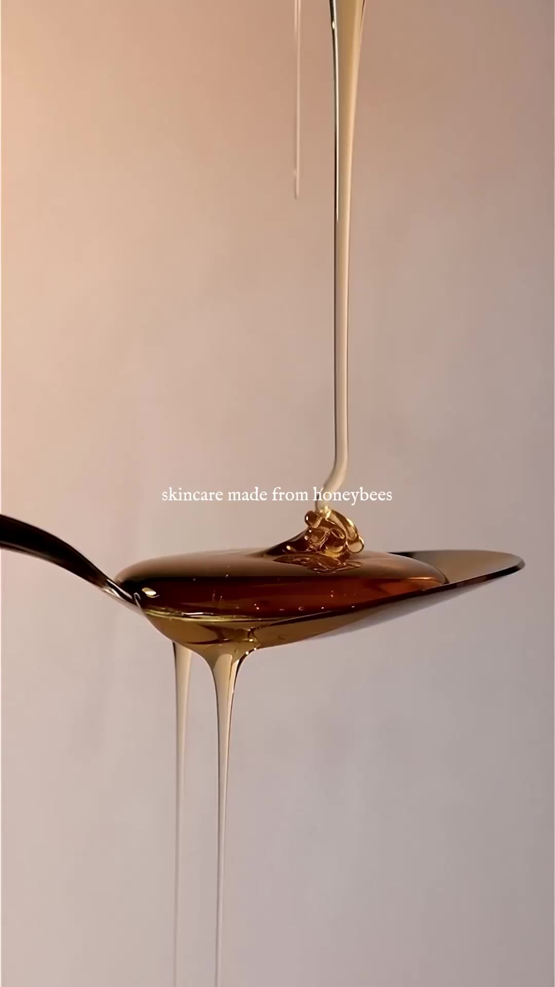
The identity therefore needed to communicate a brand made possible by bees rather than a brand decorated with bees. The current proposition still centers the hive as the actual beginning of the formulas.
I'd write this constraint simply as:
Origin, not ornament.
That feels very Keepers.
4. Make handmade feel exact.
This one is subtle and important.
Small-batch beauty has a built-in semiotic problem: the same signals that communicate authenticity can also communicate inconsistency, amateurism or lack of rigor.
Keepers needs the opposite reading.
The product should feel touched by humans and materially connected to a living landscape -- while the brand system communicates confidence, repeatability and control.
So the system needed both:
organic variation in the product
and
almost obsessive precision around the product.
That's where the grid, hierarchy, typography, numbering/ledger behavior, material choices and repeated package architecture become strategically important rather than merely tasteful. The discipline says: this may come from a hive, but nothing here is accidental.
Constraint:
Craft without amateurism.
Or better:
Human variation. Systematic precision.
That latter version feels especially strong for the case narrative.
5. Let the product names build mythology without making the line hard to shop.
This is another thing I undersold badly.
Look at the actual range:
Royal Ritual
Sacred Nectar
Wild Devotion
Apiary Essence
Golden Kiss
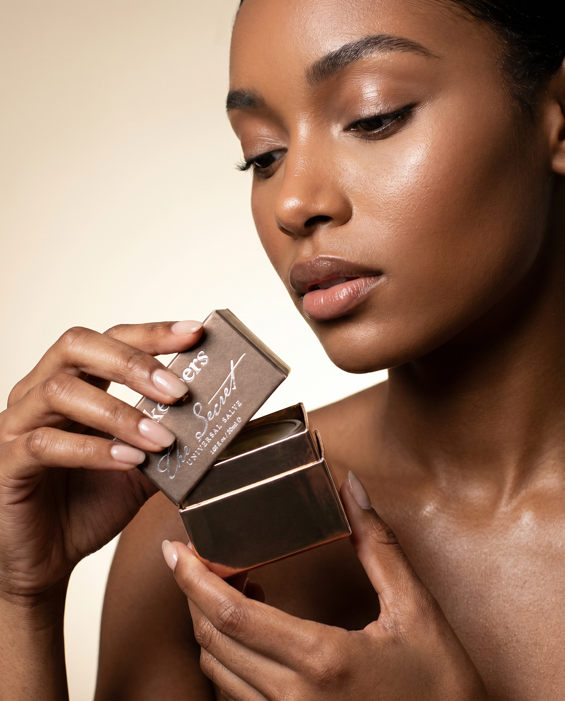
The Secret
Those names are doing enormous brand work. They create a universe. But almost none of them tells an unfamiliar shopper what is inside the package.
The functional products are cleanser, serum, facial oil, body butter, lip balm and salve.
So the packaging hierarchy had to support two simultaneous languages:
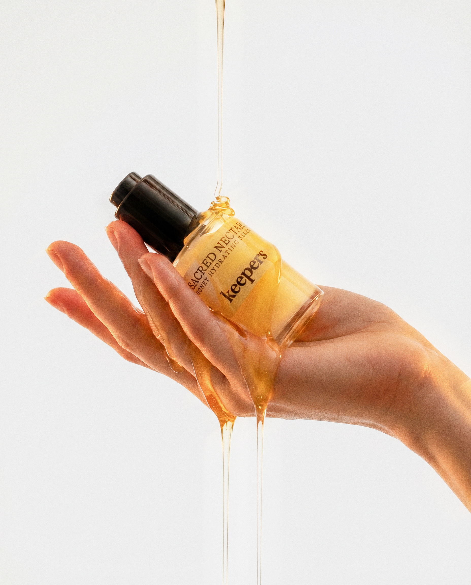
Sacred Nectar
Honeybee Hydrating Serum
The first creates memory and desire.
The second creates comprehension and purchase confidence.
You don't want to sacrifice either.
I'd call this:
Mythology without ambiguity.
That is an excellent constraint because it's visible in the actual graphic design.
6. Build collectibility without turning color into decoration.
This is where your six colorways become strategically interesting.
The point isn't "we made it in six colors."
The tension is:
Every product needed enough identity to become someone's object of attachment, while every product needed to make every other product more recognizable as Keepers.
That's different.
A rigid prestige system could make the range coherent but lifeless.
Six completely independent packages could make it expressive but destroy memory structures.
So shared typography, hierarchy, proportion, ledger/index behavior and brand marks provide the grammar. Color gets to misbehave inside the grammar.
That means the six packages together should be stronger than any one of them alone.
I'd call the constraint:
Individual objects. One visual language.
And in the narrative I'd explicitly say that the goal was not consistency for consistency's sake. It was cumulative recognition.
Every additional SKU should make the first one more recognizable.
That's genuine brand-system thinking.
7. Sell sensorial products to people who cannot touch, smell or try them.
This gets directly to the e-commerce constraint you were identifying earlier.
Skincare is experiential. Keepers is arguably more experiential than most: texture, honey, scent, viscosity, skin feel, provenance and ritual are all part of the proposition. Yet an unfamiliar DTC shopper encounters pixels first.
And Keepers isn't selling $9 commodity moisturizer. The core facial ritual currently spans a $54 cleanser, $78 serum and $88 oil.
So packaging has to do a bizarre amount of work before trial.
It needs to:
create recognition,
signal legitimacy,
hold attention in photography,
remain identifiable at thumbnail scale,
reward close inspection,
make an unfamiliar brand feel considered enough to risk putting on your skin.
This is where your earlier tag Awareness-dependent conversion becomes especially good.
As a constraint I'd call it:
Desire before trial.
That's much sharper than "needs to work in e-commerce."
8. Signal sensitive-skin care without becoming clinical.
Keepers has another valuable contradiction.
There is a real functional story around gentle formulations and sensitive skin -- Sacred Nectar, for example, is explicitly fragrance- and essential-oil-free.
But the conventional visual shorthand for efficacy and sensitivity would push you toward white laboratories, ingredient callouts, sans-serif sterility and dermatology-adjacent aesthetics.
That would be completely wrong for Keepers.
Its differentiation comes from feeling alive.
Honey. Propolis. Flowers. Hive. Texture. Land. Ritual.
The design problem was therefore:
Earn efficacy without borrowing clinical authority.
I really like that as a Keepers constraint.
9. Make sustainability invisible enough to remain beautiful.
This is another culturally smart one.
If sustainable packaging starts performing sustainability too loudly -- kraft paper, recycled flecks, green/brown palettes, eco-badges everywhere -- the package begins communicating a category before it communicates Keepers.
Your materials work, including paper formats and glass decisions, gave you another challenge: make responsible material choices part of the product's integrity rather than its aesthetic costume.
Constraint:
Responsibility without eco-signaling.
That's far more sophisticated than "packaging had to be sustainable."
Decisions
We did not solve Keepers by making it look more like premium skincare. We decided which conventions of beauty were useful, which ones would erase the brand, and which parts of Keepers were unusual enough to protect.
## 1. Protect the weirdness. Ground it in fact.
The easiest way to make Keepers more marketable would have been to edit it.
Remove the Reiki. Temper the ritual language. Turn the bees into a tasteful provenance story. Replace the founder's worldview with familiar language about clean ingredients and sensitive skin.
We chose the opposite.
Keepers' relationship with honeybees, the apiary, the hand-poured process and the more spiritual dimensions of the founder's practice were not peripheral details. Together, they made the brand difficult to confuse with anyone else.
The decision was not to make those ideas louder. It was to put enough rigor around them that they no longer needed defending.
A disciplined identity could hold *Sacred Nectar*, a working apiary, Honeybee Reiki and serious skincare in the same world without collapsing into either mysticism or clinical beauty.
We did not normalize the brand. We built a system strong enough to hold what was already unusual about it.
## 2. Make it premium without making it beige.
The previous identity read small, handmade and closer to Etsy than contemporary beauty. An obvious correction would have been to move toward the visual codes already dominating natural skincare: cream, sage, kraft, soft neutrals and restrained botanical cues.
That would have made Keepers look more expensive.
It also would have made it harder to remember.
We chose color instead.
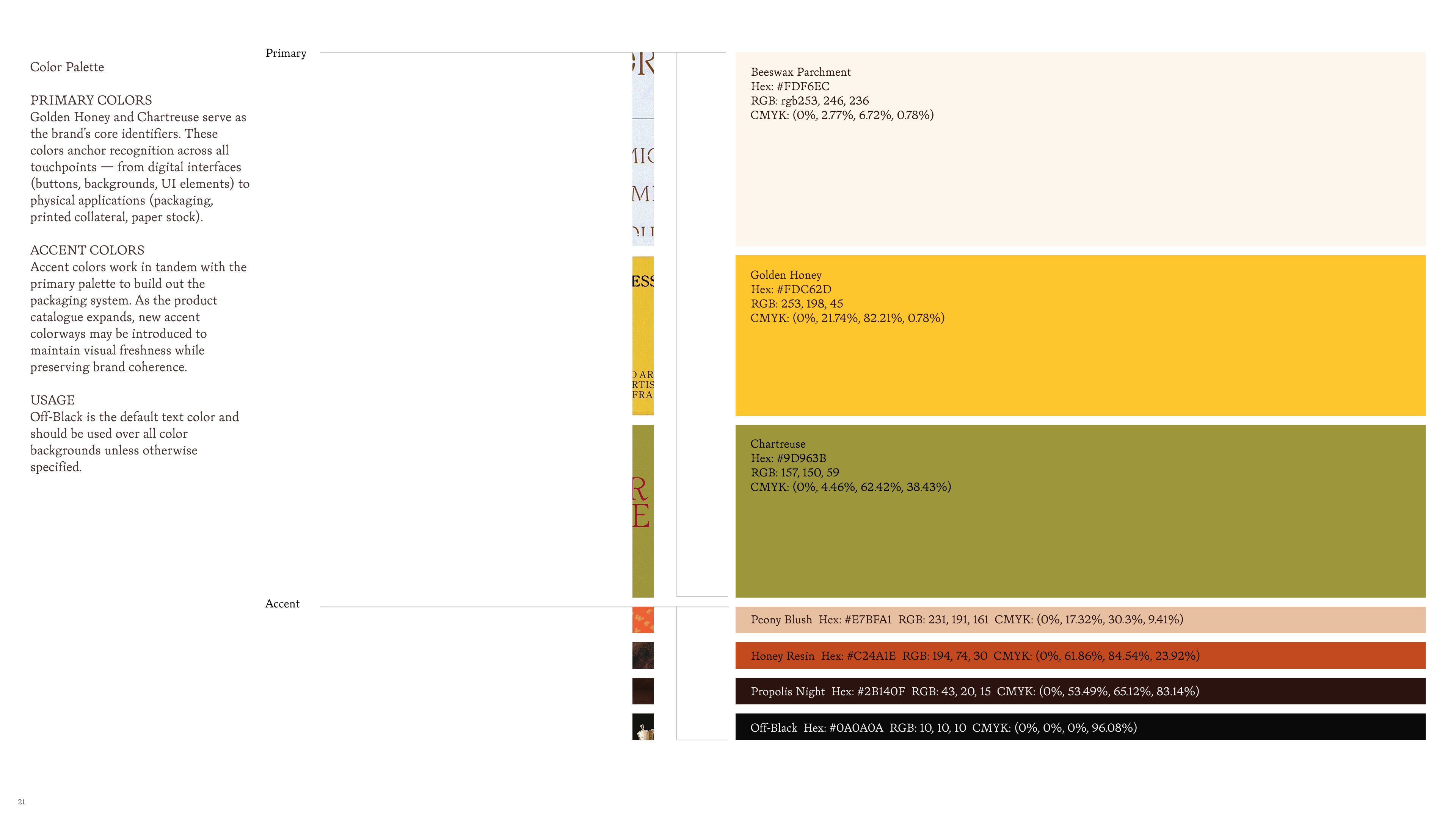
Six distinct packaging colorways gave individual products their own presence while creating a much more visible family at shelf, in photography and at the scale of an e-commerce thumbnail. Saturation became part of the identity rather than an accent applied after the fact.
The rule was simple: **premium would come from proportion, typography, material restraint and execution -- not from draining the color out of the brand.**
That decision matters even more in a low-awareness category. Keepers could not afford to look tasteful and interchangeable.
## 3. Let the smallest package make the rules.
We evaluated the identity as packaging first, not as a presentation-board logo.
That changed decisions.
An all-uppercase direction was rejected because what looked strong at scale became less useful on the smallest packaging. The mark, typography and hierarchy had to survive tubes, labels and narrow panels before they earned the right to become large brand assets.
We paired Bookish and Italian Garamond and built a highly controlled typographic hierarchy around them. Logo position, identifiers and product descriptions followed a consistent proportional structure. More expressive typographic behavior was deliberately rationed rather than allowed to become the default.
This created an important tension:
the system could feel idiosyncratic without ever feeling undisciplined.
A brand this unusual needed rules more than most.
## 4. Build a collection, not a matching set.
Six products did not need six miniature versions of the same package.
They needed to feel related enough that encountering one strengthened recognition of the other five.
So we separated what could change from what could not.
Color could change dramatically. Product names could have personality. Individual products could establish their own presence.
The underlying grammar stayed fixed: typography, hierarchy, proportion, functional information and the coded apothecary-style index.
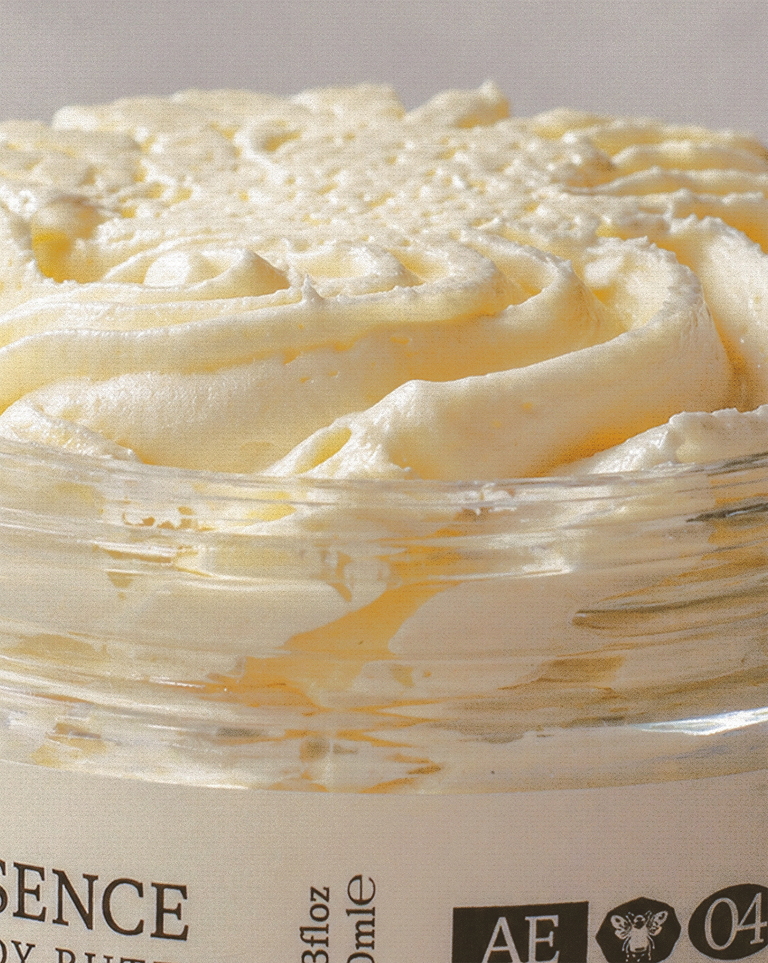
That index was especially important. A mark like **GK · [hive] · 06 · KC** does more than identify a SKU. It suggests classification, batches, sequence and a larger collection. It makes a contemporary skincare package carry a faint trace of field record, apothecary catalogue and harvest notation without imitating any of them literally.
The goal was never visual consistency for its own sake.
Every new product had to make the rest of the range more recognizable.
## 5. Name for desire. Label for certainty.
We did not ask one layer of language to do two incompatible jobs.
Names such as **Golden Kiss, Sacred Nectar, Wild Devotion, Apiary Essence, Royal Ritual** and **The Secret** create atmosphere, memory and emotional territory. They sound like Keepers rather than like search terms.
But an unfamiliar shopper still needs to know what they are buying.
So the packaging gives the evocative name room to build the world while a plain functional descriptor resolves the ambiguity: lip balm, hydrating serum, facial oil, body butter, cleansing gel, salve.
That distinction was deliberate.
The name earns attention. The descriptor earns comprehension.
For an awareness-dependent e-commerce brand, both matter. Flattening everything into functional product naming would make the line easier to understand and harder to remember. Allowing the ritual names to stand alone would make it distinctive and unnecessarily difficult to shop.
We kept both.
## 6. Design assets that could leave the box.
We did not want the identity to end at the packaging.
The strongest elements were built as reusable memory structures: the color fields, typographic hierarchy, product naming syntax, K/S behavior, botanical and hive references, and especially the coded product index.
That meant the same system could move naturally into photography, motion, social, advertising and eventually the website without requiring a new visual idea every time.
This became more important as the brand moved into marketing. The package itself contained devices capable of doing work before the customer ever held it.
The index could become an editorial marker. Color could identify Keepers at thumbnail scale. Product codes could organize content. Ritual names could become campaign language. The package family could become an image in its own right.
We weren't designing six boxes. We were deciding what Keepers would repeat until people recognized it.
Work produced
The packaging wasn't merely an aesthetic exercise. In an awareness-dependent category, the brand had to create recognition, credibility, and desire before performance marketing could efficiently convert demand.
Logo. Type. Color. Symbols. Photography. Graphic language.
Evidence and measurement
Show all six colorways together relatively early.
That single image instantly communicates something that twelve paragraphs cannot: this wasn't one pretty package. It was a packaging architecture.
Then unpack it:
Master architecture → individual SKU → shelf family → detail → production
If you have them, I would love:
flat artwork
dielines
typography/details
material/foil/print choices
side-by-side colorways
product family
photography of physical packages
prototypes/rejected concepts
brand system diagram
Results
For brand work, legitimate outcomes can be:
A coherent master identity existed for the first time
Six products could express individuality while remaining unmistakably Keepers
The system extended into photography, social, environmental, digital, etc.
The packaging became the foundation for subsequent website work
The identity gave later teams a reusable visual grammar
Retail/customer response, awards, press, sell-through, growth, or distribution if you actually have evidence for them