The Instagram Reel that shaped Spring Roll House’s brand direction
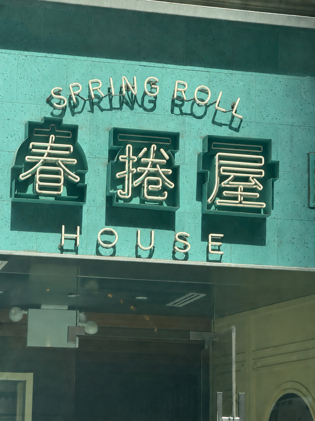

Spring Roll House began as a family food business and grew into a neighborhood phenomenon in Seattle’s Chinatown-International District. As the second generation prepared to scale their family's success, CROWN explored an identity that could travel beyond the storefront... but when our client, Tony, forwarded us an Instagram Reel that dissected the collective identity of culturally rooted businesses within an ethnic business district, we rethought everything we thought we knew about branding.

Context
This project arose from a workshop that CROWN Co-Founder Zach Huntting & Brand Strategist Amy Weiss facilitated for the 2026 Phát Triển Tốt entrepreneurial cohort, at Friends of Little Sài Gòn / Little Saigon Creative, with support from the Seattle Office of Economic Development, SBDC, Happy Fruit Studios, Seattle University, and other community partners. The workshop and larger program were designed to strengthen both emerging businesses and the neighborhood around them.
The two brothers sheparding Spring Roll House into its next phase were both at the workshop. Tony Hua-Wong was there serving as the Small Business Navigator, and Jason Hua-Wong was one of the entrepreneurs in the cohort, there to launch a different F&B business.
After immigrating from Vietnam, their mother began making spring rolls to supplement the family’s income. By 2005 the spring rolls had caught fire and they opened a storefront in Seattle's International District. Twenty years later, the two brothers were preparing to carry the business into the future... Twenty years later, the second generation was preparing to carry the business into wholesale and retail.
Most branding projects begin with the same assumption: the brand must stand apart. Find the white space. Establish a distinctive position. Create an identity that separates one company from everything around it.
Spring Roll House gave us a reason to question that premise.
Our initial brief was fairly typical: preserve the family story while creating a cleaner, more scalable identity.
Then, Tony sent us a video about the role of signage in similar communities that totally reframed the assignment. It goes like this:
- It does not start with design. It starts with familiarity.
- Across storefronts, repeated choices accumulate into a shared visual language. No single business creates it. The neighborhood does.
That began to raise a different question: could Spring Roll House become more recognizable without visually separating itself from the community that made it meaningful?
We began calling the idea distinctiveness through belonging -- a contemporary identity built not by escaping its context, but by making its relationships visible
When you look down on our fragile globe from space, you don't see a single light; however, the collective lights of New York, Paris, Shanghai, Tokyo, Los Angeles, they grab your eye. That is the power of a community.
Then we encountered a short video about the visual identity of immigrant neighborhoods.
Its argument began with a simple observation:
It does not start with design. It starts with familiarity.
A Vietnamese strip-mall sign or a Chinese restaurant window is not necessarily the product of a formal identity system. The typography may not have been selected because it was fashionable. The storefront may never have been art directed. But across businesses, blocks, families, and generations, certain choices recur: colors, type styles, illuminated signs, menu formats, product photography, bilingual language, materials, proportions.
No single business creates the language.
The neighborhood does.
Through repetition, adaptation, memory, necessity, and proximity, individual decisions accumulate into a shared visual system. What may appear to an outside designer as inconsistency can operate inside the community as recognition. What appears unpolished by the standards of the professional design industry may carry cultural information that a polished redesign would erase.
Even the familiar term vernacular design deserves scrutiny here. Designer and writer Javier Syquia argues that the label can create a false hierarchy between institutionally sanctioned, Euro-American graphic design and the visual languages produced within postcolonial and immigrant communities. His alternative is simple: recognize these artifacts as graphic design, with their own histories, purposes, and intelligence.
That changed the Spring Roll House assignment.
The question was no longer:
How do we make this neighborhood business look like a modern consumer brand?
It became:
How can one business become more recognizable without visually separating itself from the community that gives it meaning?
A different model of identity
Cross-cultural psychology gives us useful language for the tension.
Researchers distinguish between independent and interdependent models of the self. An independent self is understood primarily through internal attributes, personal preferences, and autonomy. An interdependent self is understood more relationally -- through family, social roles, mutual obligations, and membership.
These are not mutually exclusive categories. Cultures contain both orientations, expressed differently across relationships and circumstances. Global research has found substantially more variation than the traditional East-West framework suggests.
But the relational dimension is particularly relevant to this project. A 2025 study of Vietnamese participants found no significant processing advantage for the self over the mother. The researchers describe an overlap between the individual and relational self, and emphasize that self-representation changes with cultural and linguistic context.
That does not give us a visual formula, but it gives us a more useful question:
What if the fundamental unit of the identity is not the isolated company, but the company in relationship?
Conventional branding often imagines the business as an autonomous actor. Its identity succeeds by separating it from the category, occupying territory, and making an individual claim.
The work must begin with listening.
That means learning from neighborhood business owners, residents, artists, authors, and designers. It means understanding whether the product being sold is actually the most valuable service that the business provides to the neighborhood. It means recognizing differences between generations and allowing disagreement to remain visible.
Research into inclusive place branding supports this participatory model. Rather than imposing a singular identity from above, socially responsible place-branding practices involve residents in defining the meanings, values, experiences, and aspirations associated with their place.
For Spring Roll House, the logo therefore becomes more than a trademark.
It becomes a small piece of cultural infrastructure: one sign among many, one family story within a neighborhood, and one opportunity to carry a shared visual language into its next generation without cleaning away the evidence of where it came from.
Captions
Spring Roll House began in a family basement.
Word of mouth led to a Seattle storefront.
Two brothers prepared for a wider retail future.
The first brief asked for a cleaner identity.
Then Tony sent CROWN an Instagram Reel.
Its focus: the visual language shared by a neighborhood.
The question changed...
Could the brand grow while still belonging?
The brand could remain distinct
while also affirming membership.
Familiarity would not be the opposite of originality.
Belonging would become one source of distinctiveness.
The job of the logo would not simply be to say:
"Recognize me. I am different from everything around me."
It could also say:
"Recognize where I come from."
"Recognize the people and place that made me possible."
That turns conventional branding hierarchy on its head.
The individual brand does not become invisible,
but neither is it the only thing being made visible.
Every successful encounter can strengthen
recognition of the product,
the family, and the broader community
at the same time.
From branding to cultural infrastructure